

Mantes
A visual identity complete with packaging design, this collection of homebrews is brimming with character.


In a self initiated project I decided to create a visual identity for my dad who’s newfound hobby has been homebrewing for his family and friends’ events.
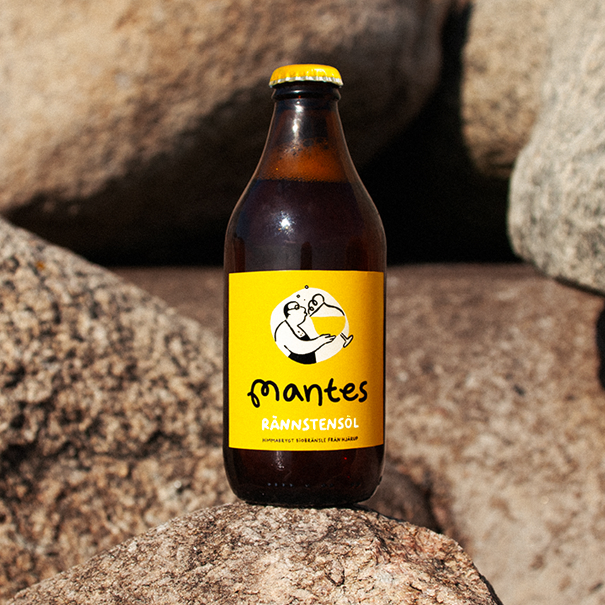
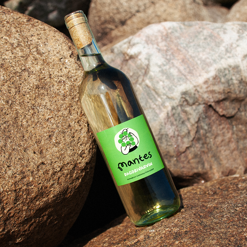
The aim was to establish a visual language with a homey, familiar feel that celebrated the handcrafted process. Centering Mante through paired back illustrations, making the labels feel as straight forward as the products themselves. Capturing the love and care behind the brew as well as Mante’s goofy personality and flair for using aprons without a shirt.
The aim was to establish a visual language with a homey, familiar feel that celebrated the handcrafted process. Centering Mante through paired back illustrations, making the labels feel as straight forward as the products themselves. Capturing the love and care behind the brew as well as Mante’s goofy personality and flair for using aprons without a shirt.
The curled line of the beer foam became a stepping stone for the design, a detail which would permeate the whole brand. A visual identity which stretched across a collection of beer, wine and cider into totes and t-shirts. Further highlighting the effortlessness and simplicity of the style against a quintessential Swedish summer backdrop, in a campaign that bubbles with character.
To read more about the project hop on over to my feature on Dieline.
To read more about the project hop on over to my feature on Dieline.


Direction & Design Frida Ek