
Seemore
An Animade sub-brand that celebrates the creative process behind the polished surface.


It was a joy directing the branding and visual identity for Seemore, a scrappy sub-brand to Animade. Launched to champion the in-house work of the creative studio, the new brand was centered around taking pride in the process.
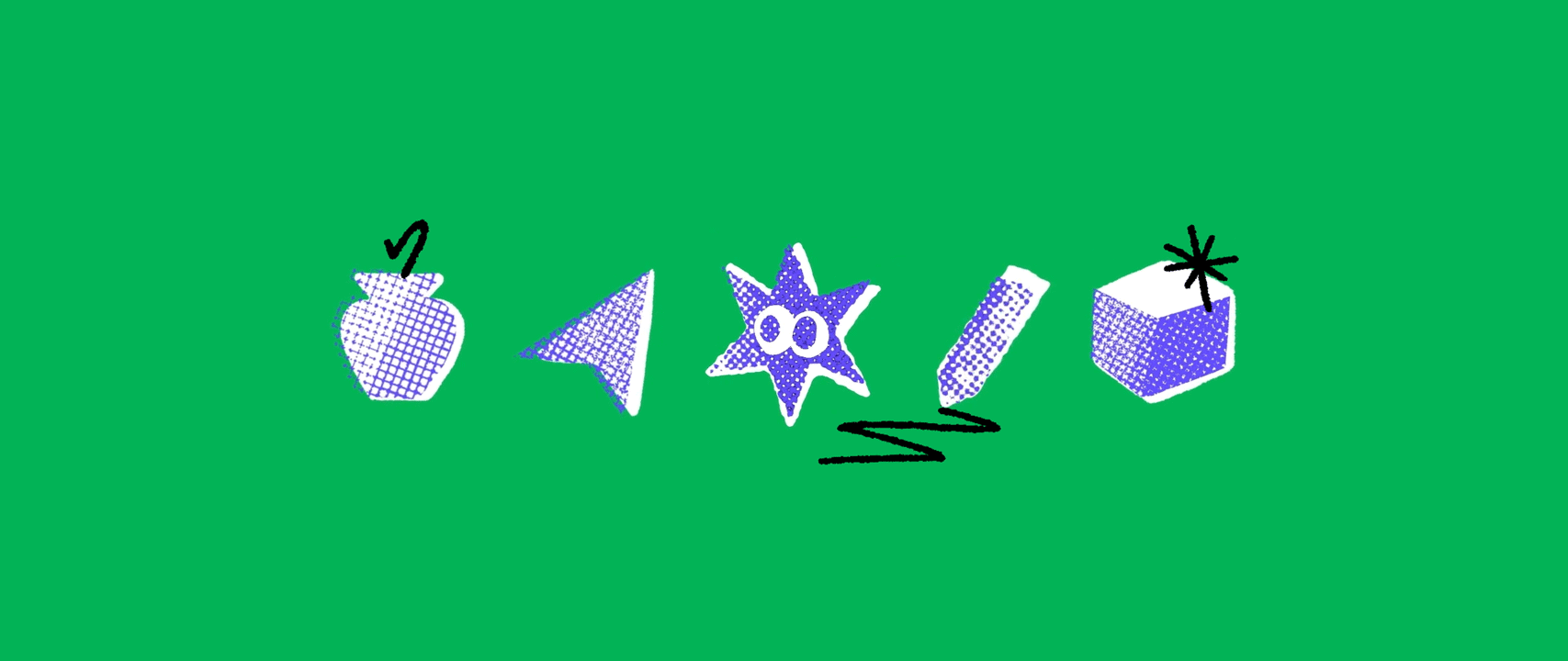
The goal was to make something that felt akin to the parent brand but that also was an ode to playful imperfections. To capture this we leaned into the unpolished nature that comes with R&D and creative exploration. Opting for a treatment with an analogue feel we experimented with risograph misprints and hand-drawn annotations and doodles.
The goal was to make something that felt akin to the parent brand but that also was an ode to playful imperfections. To capture this we leaned into the unpolished nature that comes with R&D and creative exploration. Opting for a treatment with an analogue feel we experimented with risograph misprints and hand-drawn annotations and doodles.
Giving the iconic eyes of the original logo a new, more organic look, defined both by its rough brush and wobbly animation. Combining scribbles with shapes, each symbol representing a different discipline and creative expression.
The result is an unfettered visual identity that proudly celebrates the little mistakes and honours those happy accidents that lead to greatness.
The result is an unfettered visual identity that proudly celebrates the little mistakes and honours those happy accidents that lead to greatness.


Creative Direction Frida Ek
Production Animade
Sound Design Ana Roman
Client Animade
Production Animade
Sound Design Ana Roman
Client Animade